Smart Development
#branding #sites #photography
#branding #sites #photography
Client:
Smart Development — construction company that offers detached and semi-detached turnkey house.
Task:
Design the logo and the graphic charter that reflect stability. The final version of the trademark must awaken trust and open the connection to every potential client.
Decision:
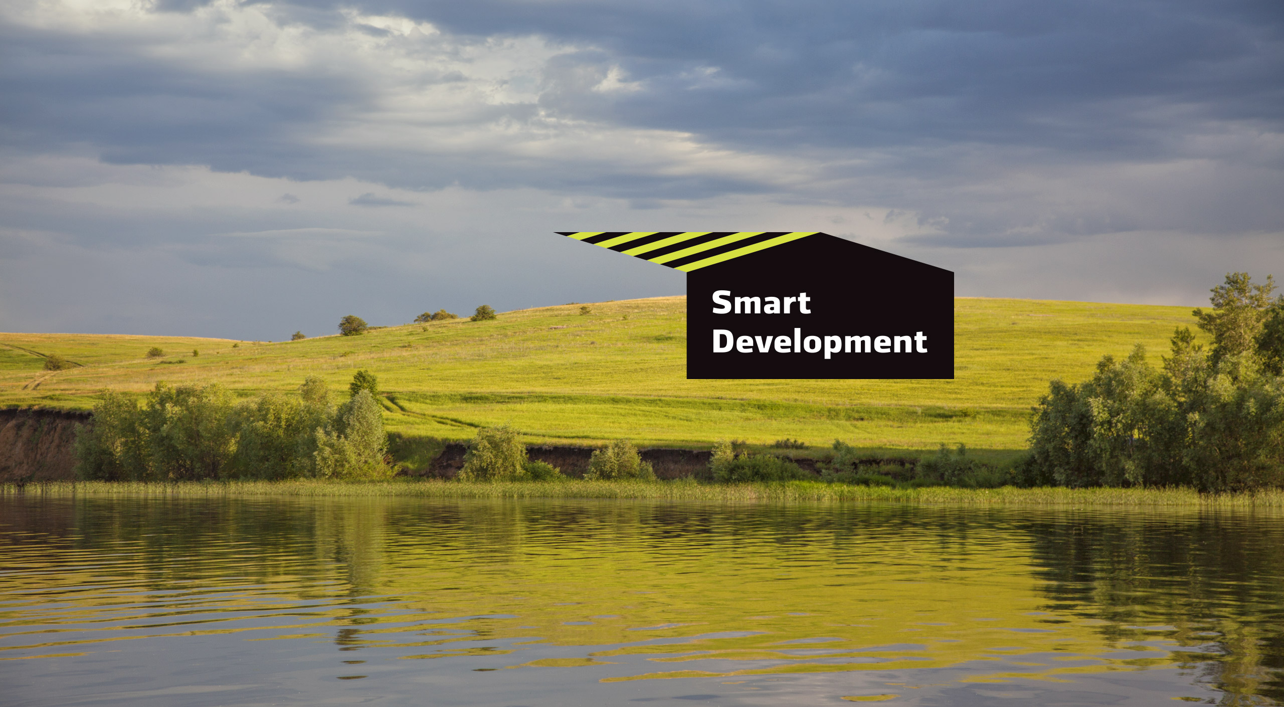
Visually the name of the company lacks balance: smart is a short word, while development is long. We put the words together within a large shape, so that the words fit inside an outline of a house.
The logo becomes multifunctional.
The shape of a house underlines the line of business, while the logo itself connects with the clients and potential buyers.
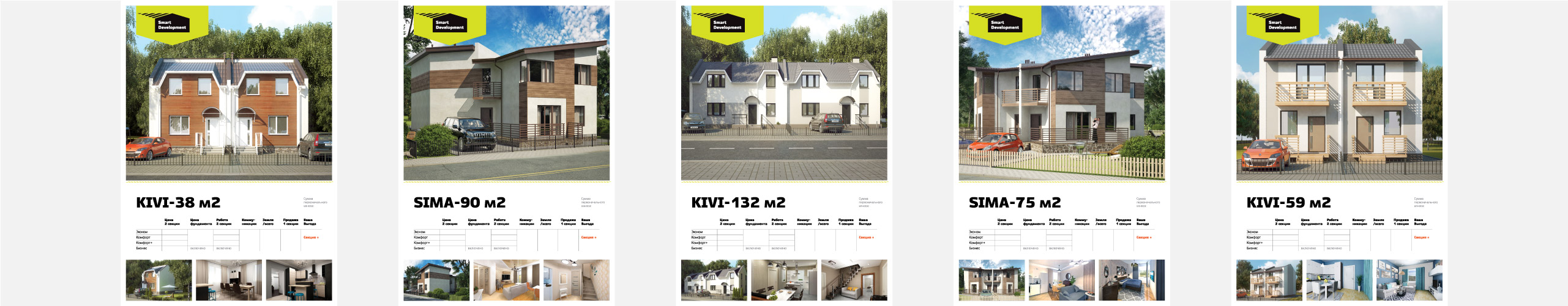
The vast versatility of the logo may be seen in the commercials and on the website of the company.
Smart Development — construction company that offers detached and semi-detached turnkey house.
Task:
Design the logo and the graphic charter that reflect stability. The final version of the trademark must awaken trust and open the connection to every potential client.
Decision:
Visually the name of the company lacks balance: smart is a short word, while development is long. We put the words together within a large shape, so that the words fit inside an outline of a house.
The logo becomes multifunctional.
The shape of a house underlines the line of business, while the logo itself connects with the clients and potential buyers.
The vast versatility of the logo may be seen in the commercials and on the website of the company.